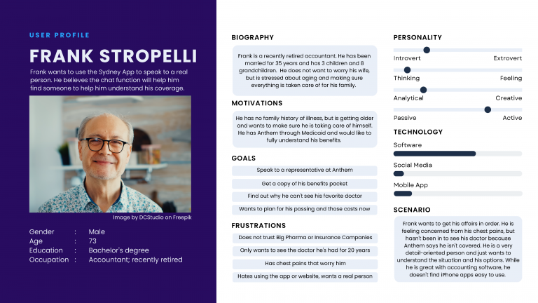
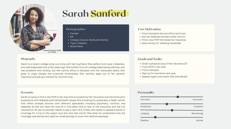
In my Sydney App redesign project, I recognized the significance of crafting user personas to ensure a user-centered approach. To effectively address the diverse needs of potential users, I decided to create two distinct personas. This approach was driven by the fundamental principle of UX design, which emphasizes the importance of representing the most common and likely user types.
The first persona I developed portrayed an elderly man seeking to access his benefits information and understand why he couldn’t see his previous primary care physician through the app. The second persona represented a young woman working as a barista, who aimed to enhance her health and find a trustworthy doctor via the app. These two personas served as the cornerstone of the redesign process, enabling me to empathize with the unique challenges and aspirations of these users and guiding me in creating a more inclusive and user-friendly Sydney App that would cater to a broader range of individuals.
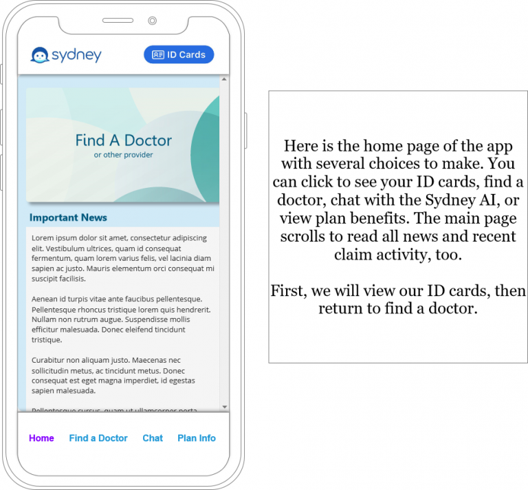
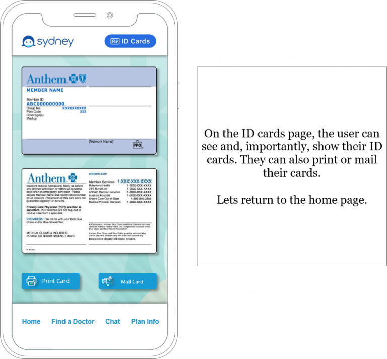
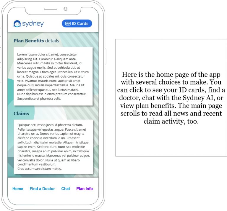
My wireframing process for the Sydney Insurance app redesign project was a crucial step in aligning the user experience with UX design principles. Leveraging Axure, I embarked on a systematic approach to create wireframes that would enhance the app’s usability and accessibility. To commence, I initiated the process by thoroughly storyboarding Sarah’s journey through the app. By doing so, I was able to empathize with her unique needs and challenges, ensuring that her perspective was integrated into the design from the very beginning.
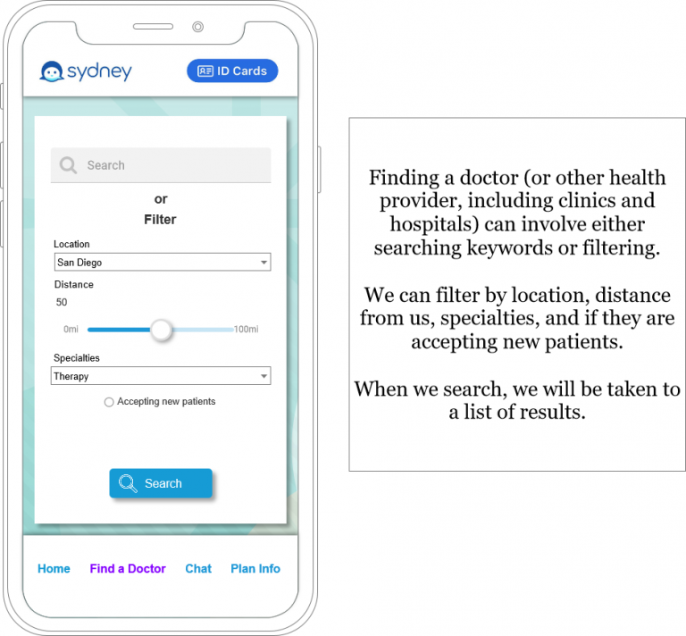
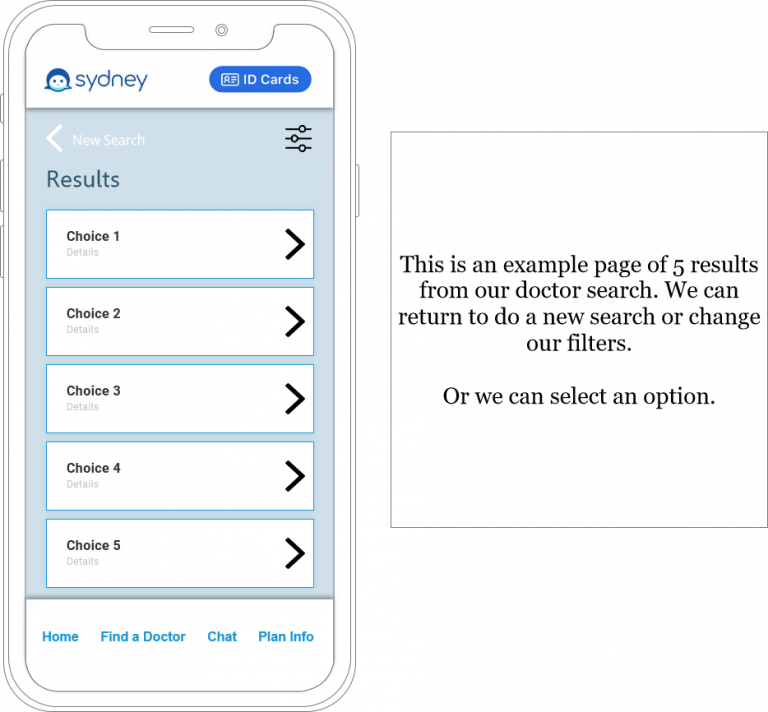
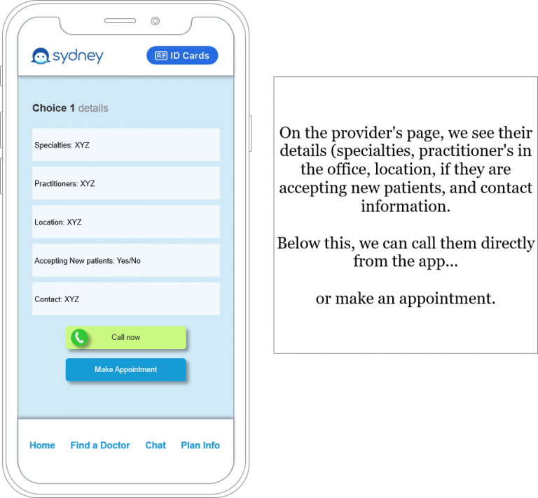
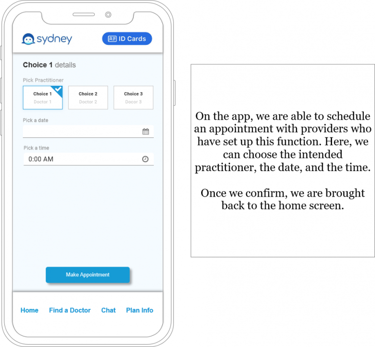
Following the initial storyboard, I transitioned into the wireframing phase. This involved creating low-fidelity prototypes that focused on the core functionalities and layout of the app. With Sarah’s profile in mind, I prioritized clarity and simplicity in the design to accommodate users who may not be well-versed in health insurance terminology. This approach involved using intuitive icons, clear labels, and straightforward navigation menus to guide users seamlessly through the app’s various features.
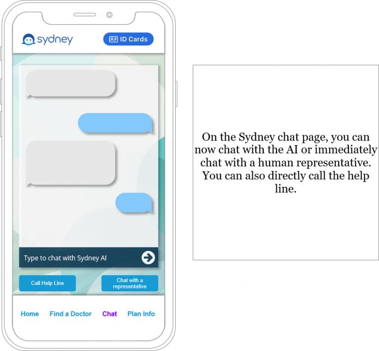
Throughout the wireframing process, I consistently referenced both Sarah and Frank, the two user personas, to ensure that the design catered to their distinct needs. Frank’s preference for human interaction was integrated by including a prominent chat function for assistance. Simultaneously, I addressed Sarah’s requirements by incorporating easy-to-understand explanations of insurance terms, streamlined access to therapy resources, and a user-friendly process for ordering a physical insurance ID. By aligning the wireframe design with the characteristics and objectives of these user personas, the Sydney Insurance app redesign aimed to deliver an inclusive and user-centered experience, ultimately enhancing the overall usability and accessibility of the application.
In addition to prioritizing ease of use, I also took into account the inherent biases users may hold about insurance companies. To foster trust and transparency, I employed design strategies aimed at conveying honesty and reliability. Clear and concise language was used throughout the prototype to simplify complex insurance terms and policies, aligning with Sarah and Frank’s needs. Furthermore, I incorporated visual elements that conveyed a sense of security, such as prominent customer support options, prominently displayed contact information, and reassuring messaging. By integrating these design elements, the prototype aimed to establish the Sydney Insurance app as a trustworthy and user-friendly resource, ultimately enhancing the user experience and mitigating any preconceived biases users may have about insurance companies.

