Sacramento Area Museums Website Redesign Case Study
Case Study, UI/UX, Visual Design, Web Design
In this case study, I tackled the redesign of SacramentoAreaMuseums.com, a website that had become outdated and lacked optimization for accessibility. The primary goal was to create a modernized, user-friendly prototype using Figma, emphasizing UX design principles while retaining the site’s overall aesthetic.
Objective
The main objective of SacramentoAreaMuseums.com is to provide information about museums in the area and promote their offerings. The site’s simplicity lies in offering surface-level details like museum hours and admission fees, with most content linking to external museum websites or a separate events and exhibits site. The primary focus for the redesign was on three core pages: Home, About, and Museums, as these were the most vital sections. Other pages, such as Jobs, were already well-executed, and several menu items led to external sites, which I maintained, streamlining the user’s journey.
The Problem
Solving the Problem
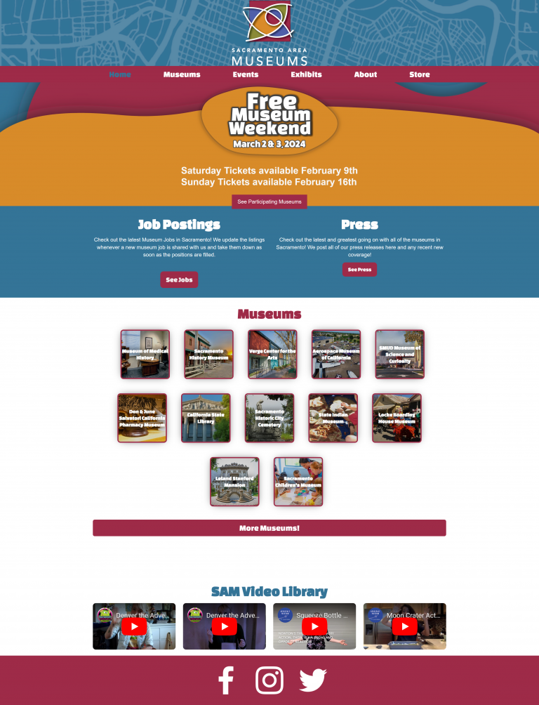
Several issues were addressed during the redesign process, starting with background colors and design. The original bright blue map of Sacramento was replaced with a more readable version, highlighting museum locations. The color palette was reduced to two main colors, aligning with the red and yellow colors from the logo.
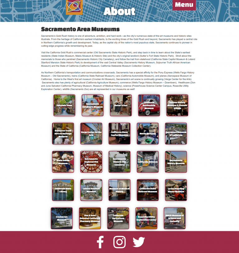
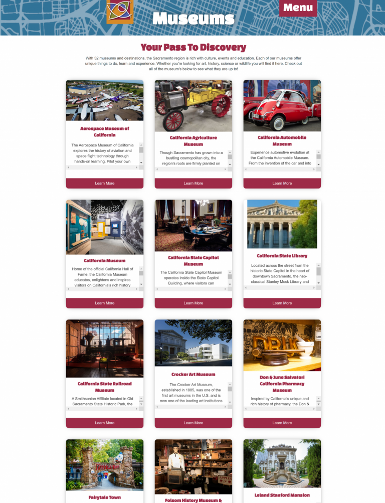
Another issue tackled was readability, especially concerning fonts. The Changa One heading font was replaced with the more legible Open Sans font. Font consistency was achieved throughout the site, with special attention to larger and more readable fonts on the About and Museums pages. The menu bar’s accessibility was also improved by keeping it visible at all times on the Museums and About pages.
One of the major challenges addressed was the picture menu/gallery for each museum, particularly on the homepage and the Museums page. The misaligned boxes, white text on image backgrounds, inconsistent font sizes, and cramped text boxes made the content hard to read. To resolve this, a cleaner and more organized picture gallery was created. On the Museums page, individual museums were given more space and easier readability by placing them on separate lines. The design of the museum boxes was simplified, eliminating borders, shading, and hard-to-read text for a cleaner and more consistent aesthetic. Additionally, redundant museum links on the About page were removed, streamlining the user experience.
Conclusion
In summary, the SacramentoAreaMuseums.com redesign focused on improving accessibility, readability, and visual consistency while maintaining the site’s overall aesthetic. The result is a modernized prototype that ensures a better user experience for the average website visitor.